Deviation Actions
While preparing the paperback version of Osiris Likes This, I took the opportunity to revise a few of my other books as well. In most cases that involved little more than making sure the front and end matter was up to date (the “Books by Damon L. Wakes” page has grown significantly since the earliest ones were first released). However, for Face of Glass, I wanted to do something a little more significant.
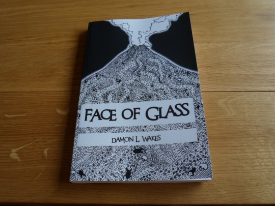
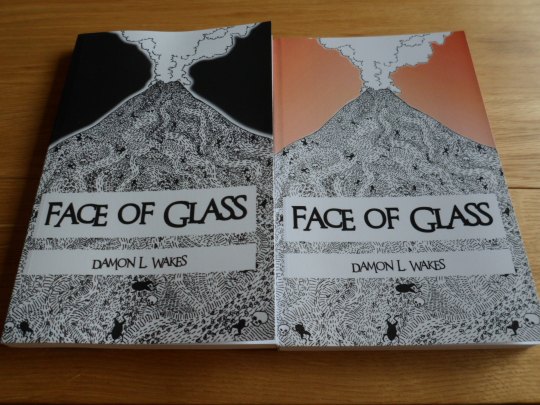
The biggest change is the colour. The cover is now entirely greyscale, with a solid black sky. When I was first putting the book together, the artist sent me several different versions of this cover, each with a different colour sky behind the mountain. Ultimately, it was a tough choice between a tropical blue and a sinister orange/red. Black wasn’t one of the original colour choices, but it’s since become a very attractive option for one simple reason.
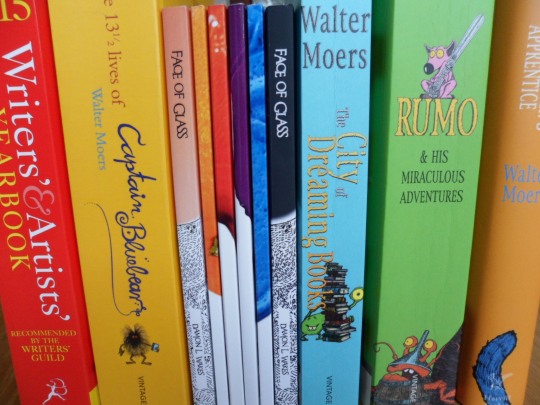
When I appeared at a book fair earlier this year, I noticed both that my series of flash fiction anthologies tended to attract more attention than my novel, and that people often assumed that all (then) four books were part of the same series. Looking at the bookshelf lineup above, it’s not hard to see why. All my books, flash fiction or otherwise, have a white strip at the bottom and a coloured section at the top.
I didn’t plan this. I’m happy it gives the books some kind of brand, and that they don’t clash on the shelf, but since Face of Glass came out before there even was a flash fiction series (and I had no hand in the design of the cover in the first place), it definitely wasn’t deliberate. However, looking at the original Face of Glass spine on the left, it does look like it belongs with the series at a glance. The new spine on the right could still cause some confusion, but I think because it’s a solid black rather than a coloured image, it’ll be clearer that it’s a standalone novel. I feel as though this makes for a good compromise between keeping all the books similar and keeping the novel distinct.
Though the colour is the biggest change, it’s certainly not the only one. Put side by side, you’ll also notice that the artwork is darker and bolder, particularly around the peak of the mountain. For reasons that are totally beyond me, the original artwork was very slightly pixellated: that was the very first thing that made me want to have another go at the cover. The simplest, most effective way to fix this was simply to blur the artwork slightly (on a new layer, beneath the unchanged original so that all the lines remained sharp). This had the added bonus of making all the lines slightly thicker, which seems to help some of the details pop out (especially where they’re clustered together).
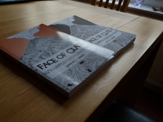
Another big change is that the new cover is matte rather than glossy. This photo really shows the difference between the two. Createspace’s glossy covers are shiny enough that you don’t just get glare on them: you can make out the whole reflection of the lightbulb or window or whatever’s causing it. I wasn’t originally a fan, but Createspace didn’t originally offer any alternative, so I was kind of stuck. Also the gloss covers grew on me over time: I’ll be keeping them for the flash fiction Month series for reasons I’ll get into below.
For Face of Glass, a matte cover really seemed like the way to go, and having had a chance to get hold of a real, physical copy of the new book for myself I’m convinced that was the right decision. I actually made the switch from glossy to matte a little while ago, but I don’t believe anybody’s actually ordered the old cover in the new finish (if you have, there’s a good chance that your book is the only one of its kind in the entire world!). The matte feels really nice. It’s velvety, and the artwork and lettering feels almost embossed: there’s a definite texture there. It also does a good job of making the black look really black. Overall, it just seems like the perfect match for a serious novel rather than a collection of mostly frivolous flash fiction pieces.
The matte finish does have a couple of downsides, though. One is that the black shows up fingerprints (though in this case the white portions of the cover are more likely to be handled, making this less of an issue). The other is that the cover doesn’t feel quite as durable (though I haven’t had a chance to confirm this and don’t particularly want to ruin my book). The glossy covers feel just about indestructible, and I’d trust them to offer at least a degree of protection from spilled drinks or rainy days. Essentially, the matte finish looks significantly better but probably isn’t the most practical of the two. I’m 100% happy with it for this particular book, but for the flash fiction anthologies (which are ideal for stuffing in a bag and then reading on the bus), I’ll be sticking with the glossy covers for the extra protection.
In much the same way as I would have opted for a matte finish from the beginning if I’d had the option, here’s another change to the book that takes it a step closer to what I originally had in mind: drop caps. Each chapter of the redesigned paperback features a large initial capital letter at the start of the first paragraph. I’m aware these are extremely old-fashioned (predating the printing press, in fact) and that they tend to divide opinion among designers, but for this particular book I was keen to have them. Face of Glass is, fundamentally, a story about stories, and I think this style of text helps draw attention to that. The only reason the book didn’t include drop caps from the beginning is that I constructed the interior file using the text of the ebook, for which I had to omit them in order to comply with certain standards. By the time I realised I hadn’t included them in the paperback, I’d already approved the proof copy and felt it would be best to work them in alongside more substantial changes (here the cover and the cover finish).
Finally, this new version of Face of Glass incorporates changes suggested by GDeyke, who also gets a mention in the Acknowledgements for all the help. This has already been the case in certain versions of the ebook, but I’m happy to say that all copies of Face of Glass, electronic or otherwise, are now uniform and up to date.
If you’d like a copy of the new paperback (or the ebook with the new cover), you should be able to get it through all the same channels as before. Chances are your best bet is Amazon UK, Amazon US, or direct from Createspace. If you’ve got no other preference, Createspace gives me slightly better royalties, but may not offer you the best deal (particularly in terms of shipping). If you’re in the US, Amazon US should offer you a Kindle version of the book free with the paperback, so they’re almost certainly the place to get it over there.
Super Hyper Awesome Game: EXTREME!
New Game: Rainbow Bears Fun Maze
New Book: Big Shoes To Fill
Witness Not the Watcher has a Daily Deviation!
Seriously though, the new cover looks awesome. Even aside from the fact that it stands out more from the FFM series, I prefer the black: it pops out a lot better, especially in conjunction with the bolder lines and the thicker white glow around the mountain. The new design looks more like something I'd consider picking up without having heard of it before.
I should seriously look into paperbacks myself, sometime. It's one of those things I've been meaning to get around to for several months, but just haven't found the time and motivation to actually get started on yet.
